heatmapChart
Visualize matrix data with color-coded cells for pattern identification.
Usage
const chart = block.heatmapChart({
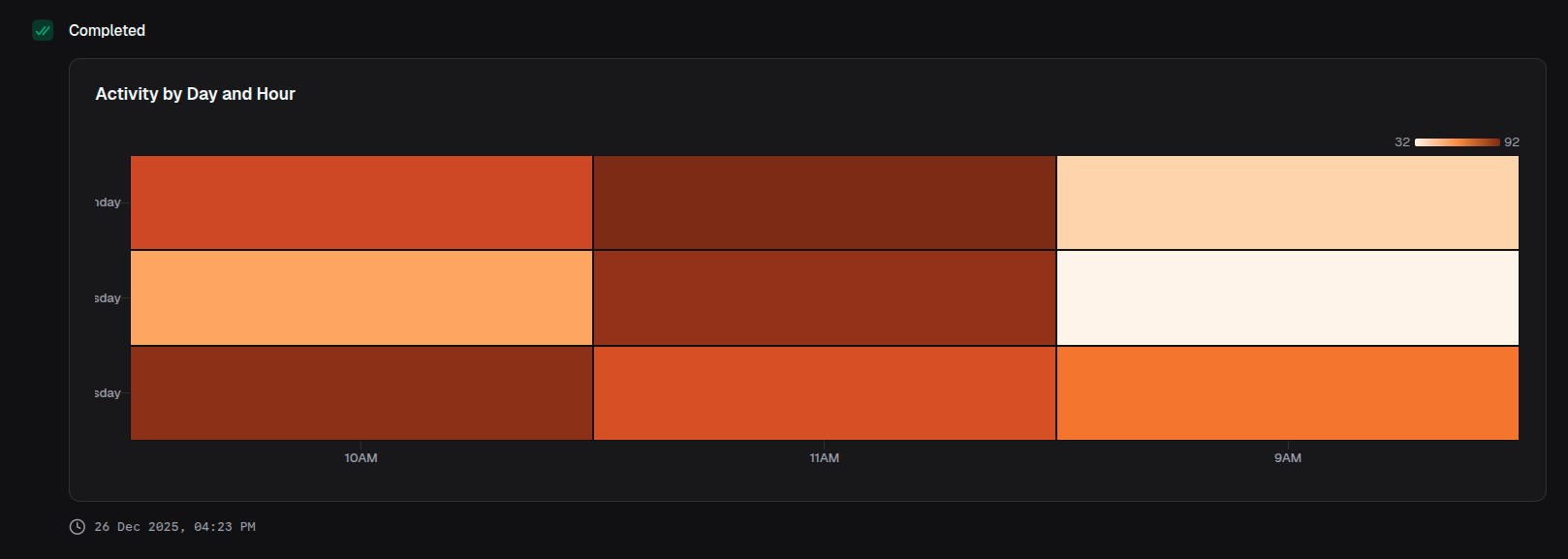
title: 'Activity by Day and Hour',
data: [
{ hour: '9AM', monday: 45, tuesday: 32, wednesday: 67 },
{ hour: '10AM', monday: 78, tuesday: 56, wednesday: 89 },
{ hour: '11AM', monday: 92, tuesday: 88, wednesday: 76 },
],
xAxis: 'hour',
yAxis: ['monday', 'tuesday', 'wednesday'],
})Props
| Prop | Description | Type | Required | Default |
|---|---|---|---|---|
| title | Chart title displayed above the chart | string | No | undefined |
| description | Description text below the title | string | No | undefined |
| data | Array of data objects to visualize | T[] | Yes | — |
| xAxis | Key of the data object for x-axis (columns) | keyof T | Yes | — |
| yAxis | Keys of the data object for y-axis (rows) | (keyof T)[] | Yes | — |
| colorScale | Color scale for mapping values | ColorScale | No | 'Oranges' |
| xAxisLabel | Label for the x-axis | string | No | undefined |
| yAxisLabel | Label for the y-axis | string | No | undefined |
| showXAxis | Whether to display the x-axis | boolean | No | true |
| showYAxis | Whether to display the y-axis | boolean | No | true |
| showTooltip | Whether to display tooltips on hover | boolean | No | true |
| showLegend | Whether to display the color legend | boolean | No | true |
| showValues | Whether to display values on cells | boolean | No | false |
| valueFormat | Format configuration for values | ValueFormat | No | undefined |
Returns
Returns a HeatmapChartOutput object that can be returned from a handler or passed to io.message().
Color Scales
Predefined Color Scales
Tool Forge supports D3 color scales:
type PredefinedColorScales =
  | 'Blues'
  | 'Greens'
  | 'Oranges'
  | 'Reds'
  | 'Purples'
  | 'Greys'
  | 'BuGn'
  | 'BuPu'
  | 'GnBu'
  | 'OrRd'
  | 'PuBu'
  | 'PuRd'
  | 'RdPu'
  | 'YlGn'
  | 'YlGnBu'
  | 'YlOrBr'
  | 'YlOrRd'
  | 'BrBG'
  | 'PiYG'
  | 'PRGn'
  | 'PuOr'
  | 'RdBu'
  | 'RdGy'
  | 'RdYlBu'
  | 'RdYlGn'
  | 'Spectral'
  | 'Viridis'
  | 'Inferno'
  | 'Magma'
  | 'Plasma'
  | 'Cividis'
  | 'Turbo'
  | 'Warm'
  | 'Cool'
  | 'Rainbow'
  | 'Sinebow'
Custom Interpolated Scale
colorScale: {
  min: 'blue',
  max: 'red',
}
Examples
Weekly activity heatmap
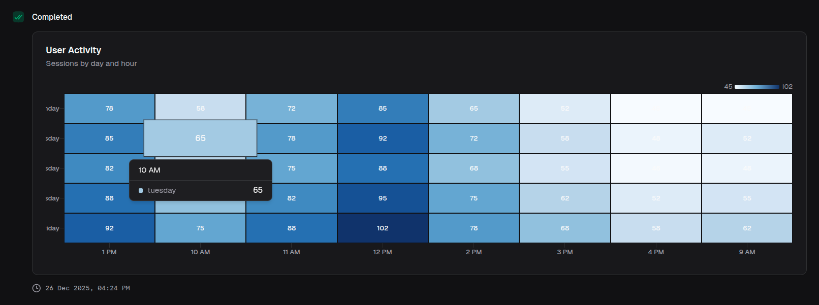
return block.heatmapChart({
  title: 'User Activity',
  description: 'Sessions by day and hour',
  data: activityData,
  xAxis: 'hour',
  yAxis: ['monday', 'tuesday', 'wednesday', 'thursday', 'friday'],
  colorScale: 'Blues',
  showValues: true,
})
Correlation matrix
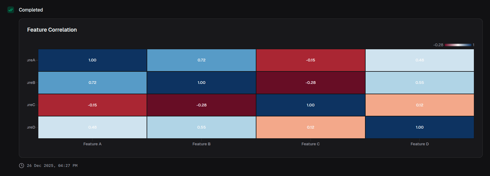
return block.heatmapChart({
  title: 'Feature Correlation',
  data: correlationData,
  xAxis: 'feature',
  yAxis: ['featureA', 'featureB', 'featureC', 'featureD'],
  colorScale: 'RdBu',
  valueFormat: { type: 'number', decimals: 2 },
  showValues: true,
})
Custom color scale
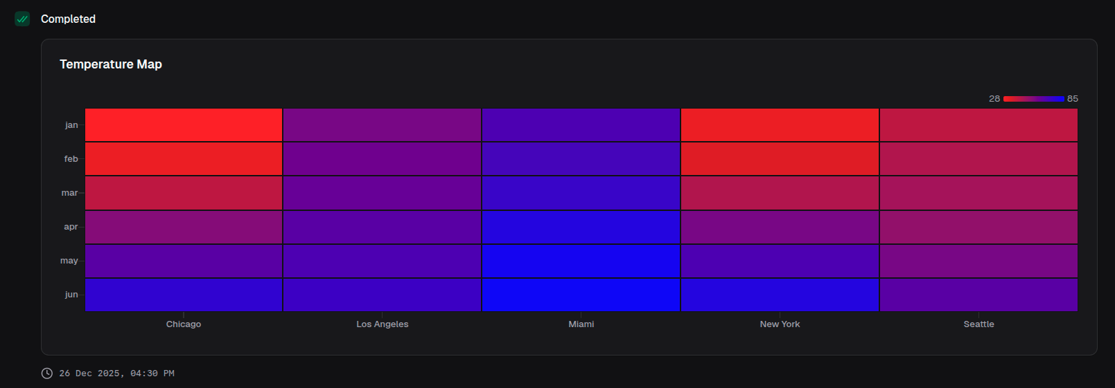
return block.heatmapChart({
  title: 'Temperature Map',
  data: temperatureData,
  xAxis: 'location',
  yAxis: ['jan', 'feb', 'mar', 'apr', 'may', 'jun'],
  colorScale: {
    min: 'blue',
    max: 'red',
  },
})
With axis labels
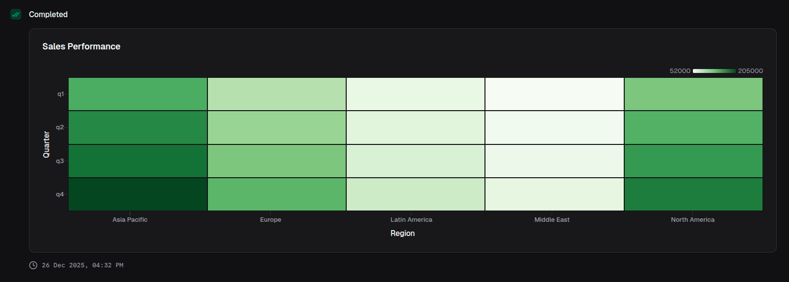
return block.heatmapChart({
  title: 'Sales Performance',
  data: salesData,
  xAxis: 'region',
  yAxis: ['q1', 'q2', 'q3', 'q4'],
  xAxisLabel: 'Region',
  yAxisLabel: 'Quarter',
  colorScale: 'Greens',
  valueFormat: { type: 'currency', currency: 'USD', notation: 'compact' },
})