lineChart
Create line charts to display trends and changes over continuous data.
Usage
const chart = block.lineChart({
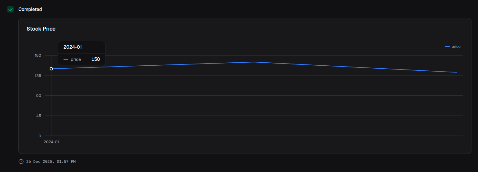
title: 'Stock Price',
data: [
{ date: '2024-01', price: 150 },
{ date: '2024-02', price: 165 },
{ date: '2024-03', price: 142 },
],
index: 'date',
categories: ['price'],
})Props
| Prop | Description | Type | Required | Default |
|---|---|---|---|---|
| title | Chart title displayed above the chart | string | No | undefined |
| description | Description text below the title | string | No | undefined |
| data | Array of data objects to visualize | T[] | Yes | — |
| index | Key of the data object for the x-axis | keyof T | Yes | — |
| categories | Keys of the data object for the line series | (keyof T)[] | Yes | — |
| colors | Colors for each category series | ChartColor[] | No | ['blue'] |
| xAxisLabel | Label for the x-axis | string | No | undefined |
| yAxisLabel | Label for the y-axis | string | No | undefined |
| intervalType | X-axis tick placement logic | 'equidistantPreserveStart' | 'preserveStartEnd' | No | 'equidistantPreserveStart' |
| startEndOnly | Show only start and end labels on x-axis | boolean | No | false |
| showXAxis | Whether to display the x-axis | boolean | No | true |
| showYAxis | Whether to display the y-axis | boolean | No | true |
| showGridLines | Whether to display grid lines | boolean | No | true |
| showTooltip | Whether to display tooltips on hover | boolean | No | true |
| showLegend | Whether to display the legend | boolean | No | true |
| valueFormat | Format configuration for values | ValueFormat | No | undefined |
Returns
Returns a LineChartOutput object that can be returned from a handler or passed to io.message().
Examples
Multi-series line chart
return block.lineChart({
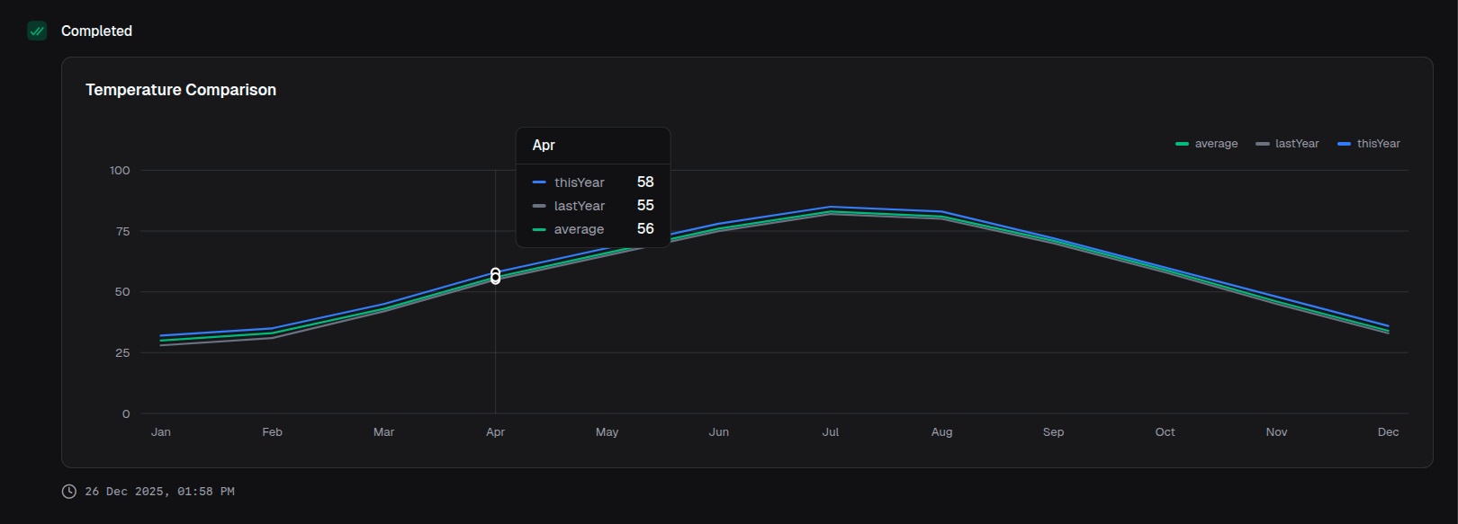
title: 'Temperature Comparison',
data: temperatureData,
index: 'month',
categories: ['thisYear', 'lastYear', 'average'],
colors: ['blue', 'gray', 'emerald'],
})With axis labels
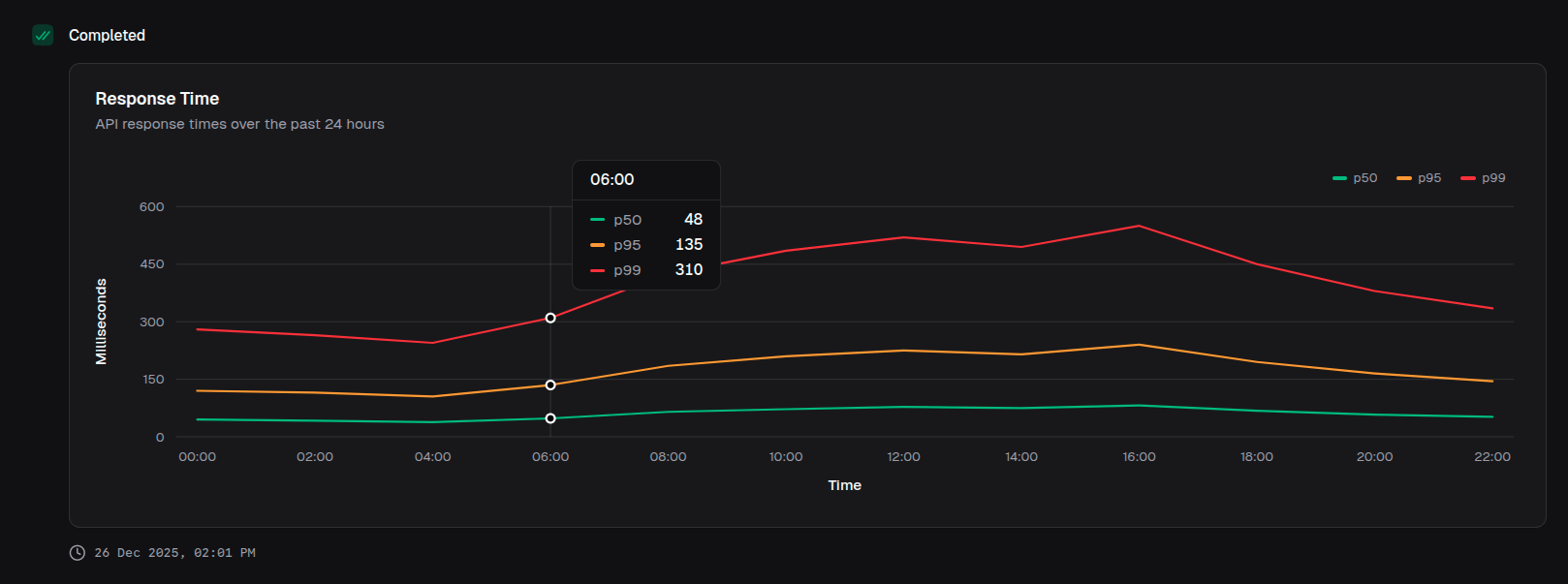
return block.lineChart({
  title: 'Response Time',
  description: 'API response times over the past 24 hours',
  data: responseData,
  index: 'time',
  categories: ['p50', 'p95', 'p99'],
  colors: ['emerald', 'amber', 'red'],
  xAxisLabel: 'Time',
  yAxisLabel: 'Milliseconds',
})
Minimal sparkline-style
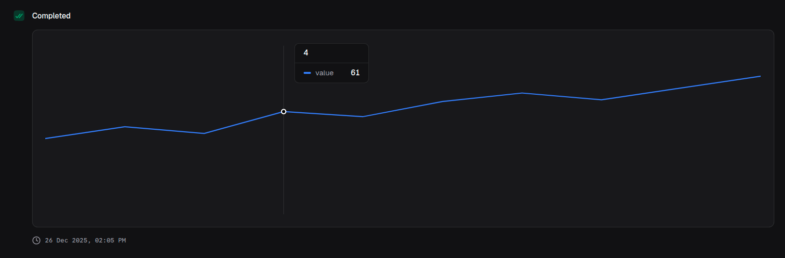
return block.lineChart({
  data: trendData,
  index: 'time',
  categories: ['value'],
  showXAxis: false,
  showYAxis: false,
  showGridLines: false,
  showLegend: false,
})
With percentage formatting
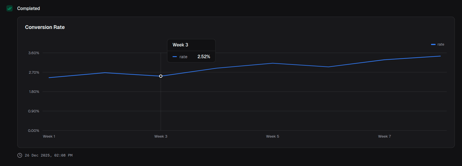
return block.lineChart({
  title: 'Conversion Rate',
  data: conversionData,
  index: 'week',
  categories: ['rate'],
  valueFormat: {
    type: 'percentage',
    decimals: 2,
  },
})